Kore's Design Eye · New England Landmark Realty (NELR)
Vermont's low-angle winter sun and flat mud-season skies are merciless on cool-gray and bright-white paint colors — rooms that looked fine to you for years will photograph cold, flat, and uninviting to buyers scrolling listings on a Tuesday night. The fix is a warm-undertone neutral, one weekend of rolling, and the full backing of every major paint brand in 2026, which have collectively — and finally — declared cool gray over.
If you only do 3 things- Test your paint under a gray Vermont sky, not a sunny one. Stand in your main room on an overcast morning. If the walls look icy, bluish, or flat — the undertone is wrong, and so are your listing photos.
- Repaint north-facing and main-living rooms in a warm-undertone neutral before the photographer arrives. One room, done right, changes the entire photographic read of your home online.
- Swap every bulb in photographed rooms to 2700K warm white. Twenty minutes. Under $25. The cheapest thing you can do that actually works.
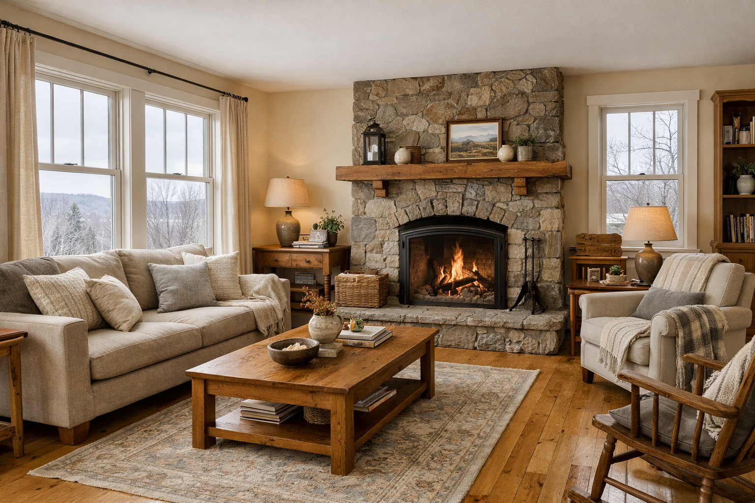
The buyer-ready Vermont living room: warm undertones, natural wood, overcast light — and a buyer who stayed.
The Moment Buyers Decide
You picked a neutral. You played it safe. You went with the gray that looked absolutely flawless in the Burlington paint aisle — maybe even the one your neighbor used. And now your listing photos look like the inside of a walk-in refrigerator. Welcome to Vermont's light problem.
Vermont's ambient light — low-angle from November through April, flat and gray through mud season — is one of the most demanding lighting environments in New England for interior photography. It doesn't forgive cool undertones. It amplifies them. A color that reads "sophisticated gray" under a showroom's recessed LED reads "cold storage" under an overcast March sky in Waterbury.
Buyers walk in expecting the warmth from the listing description. Their nervous systems quietly disagree. They spend twelve minutes instead of thirty. They say "we'll think about it." They don't call back.
The Quiet Problem: It's Not Your Color. It's Your Undertone.
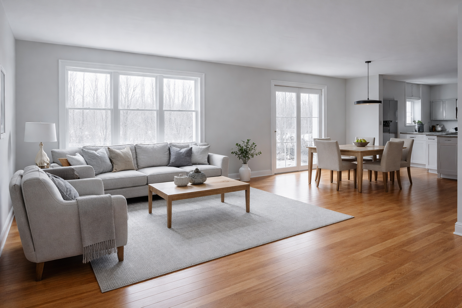
The cool-gray trap: a decent house, a reasonable neutral, and Vermont light doing what Vermont light does.
Most Vermont homes built between 1985 and 2020 default to cool-gray or bright-white walls — colors with blue or purple undertones that look polished in a magazine and icy in an old colonial. Here's the quiet problem: buyers don't think "the undertones are fighting the floor." They think "something's off." They feel vaguely unsettled, they can't name it, and they leave.
Here's what makes it worse: Vermont's honey-oak and wide-plank hardwood floors are warm. The original trim in most farmhouses and Capes is warm cream or antique white. Cool gray walls don't complement those finishes — they fight them. Every surface in the room is pulling in a different thermal direction, and the buyer's eye can't settle anywhere.
This isn't about taste. It's about perception. And it shows up most brutally in listing photography — the very medium through which 95% of buyers decide whether to set foot in your home.
The Fix: A Palette Reset, Not a Renovation
Swap every bulb in photographed rooms to 2700K warm white. This alone costs under $25 and changes the entire thermal register of the room. Add one warm-toned throw blanket and a pair of ivory or linen pillow covers. You're not repainting — you're correcting.
Payoff: warmer listing photos, no ladder required, done before Sunday dinner.
Repaint the rooms buyers see in the first 90 seconds: entry, living room, the kitchen sightline from the front door. Choose a warm-undertone neutral — SW Natural Linen SW 9109, BM Wind's Breath OC-24, or the 2026 Sherwin-Williams Color of the Year, Universal Khaki SW 6150 — an earthy warm beige-khaki that was, frankly, built for Vermont's housing stock.
Payoff: cohesive online photos, buyers who linger instead of leave, and a listing that photographs 30% warmer than the one next door. (Approximate — but you'll feel it.)
Full main-level repaint in a warm, undertone-consistent palette anchored to your floors. Pull the warmest tone from your hardwood or existing trim and work outward from there. BM Natural Wicker 950 and Dutch Boy Melodious Ivory 313-2DB — Dutch Boy's own 2026 Color of the Year, a buttery warm ivory specifically praised for low-light performance — are exceptional in Vermont conditions.
Payoff: every room in your listing flows, buyers feel calm the moment they walk in, and you're not discounting the price because "something felt off" to every person who came through.
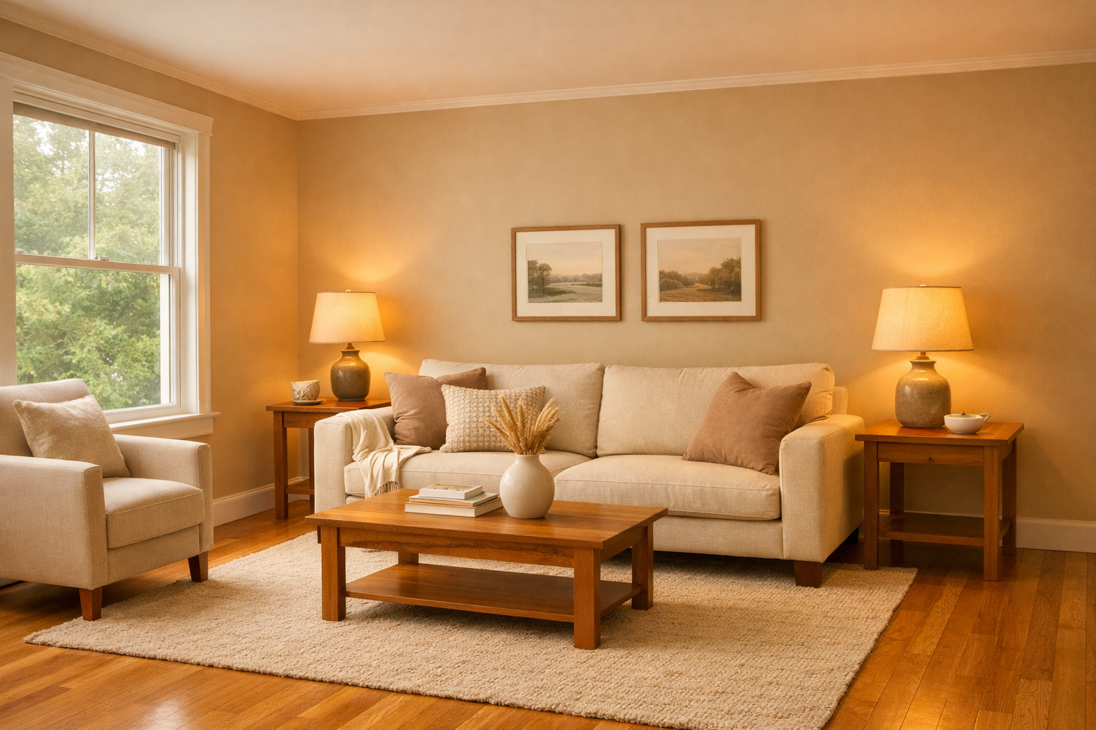
Same room. Warm undertone. Completely different buyer reaction. This is what the camera sees — and what the buyer feels.
Vermont Homes Were Built for Warmth. The Trend Fought That.
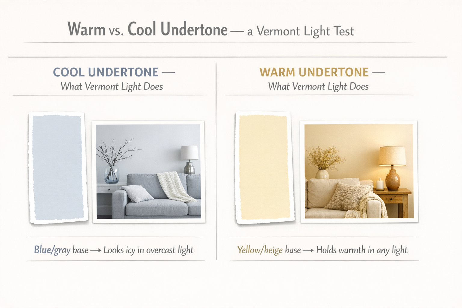
The Vermont Light Test: cool undertones vs. warm undertones under the same overcast sky. One feels like a home. One feels like a deposition.
Here's the good news you didn't expect: the entire paint industry just caught up to Vermont. Every major brand's 2026 Color of the Year — Sherwin-Williams, Dutch Boy, Valspar, C2 Paint — is a warm, earthy, grounded neutral. Cool gray had a decade-long run, sold a lot of paint, and made a lot of Vermont listing photos look like a deposition room. That era is over.
Vermont's housing stock was built for warmth. Wide-plank floors, exposed beams, stone fireplaces, and hand-painted trim: these bones want a warm palette. The homes that fought that instinct with trendy cool grays are now correcting course. The homes already painted in warm neutrals? They're the ones generating showings in March when the mud is still ankle-deep and the light is at its absolute worst.
One note for the out-of-state buyers who've moved to Central Vermont from Boston, New York, or Connecticut: you were used to different ambient light. Vermont's north-facing light in winter has a blue cast that feels nothing like your old south-facing brownstone. If your new home is still wearing the cool gray you brought with you — it's time to let Vermont teach you something about warmth.
If you're listing this spring, your photographer is your first buyer. What the camera sees under Vermont's gray sky is what every online buyer sees first. Make it warm.
The Bottom Line
You don't have to live with a listing that photographs cold. You don't have to drop your price because buyers couldn't articulate what was wrong. And you don't have to hire a designer, take a color theory class, or watch fourteen hours of HGTV to solve this.
You need a warm undertone, a warm bulb, and someone who can tell you which of the three tiers above your home actually needs. That's what New England Landmark Realty (NELR) does — we triage what actually moves the needle before you spend money on things that don't.
Let's Make It Easy for a Buyer to Say Yes.
Send Tony your listing photos and he'll give you a one-weekend plan — what to fix, what to leave alone, and whether you need a brush or just a new light bulb. If you're considering a price change, we'll fix the presentation first. You'll discount more than you need to if you don't.
Tony Walton, Principal Broker
Cell: (802) 233-4107
Office: (802) 253-4711 or (866) 324-2427